
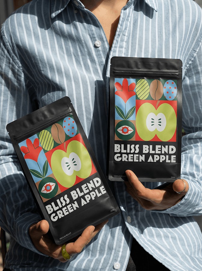
Bliss Blend Green Apple had a specific personality to work with — a specialty coffee with a bright, unexpected tasting note. The packaging needed to match that energy: not the usual minimalist roaster look, not kraft paper and sans-serif. Instead, a bold graphic label built around folk-inspired illustration — geometric shapes, florals, a cross-cut apple, coffee beans woven throughout. Something that reads as a collectible, not a commodity.
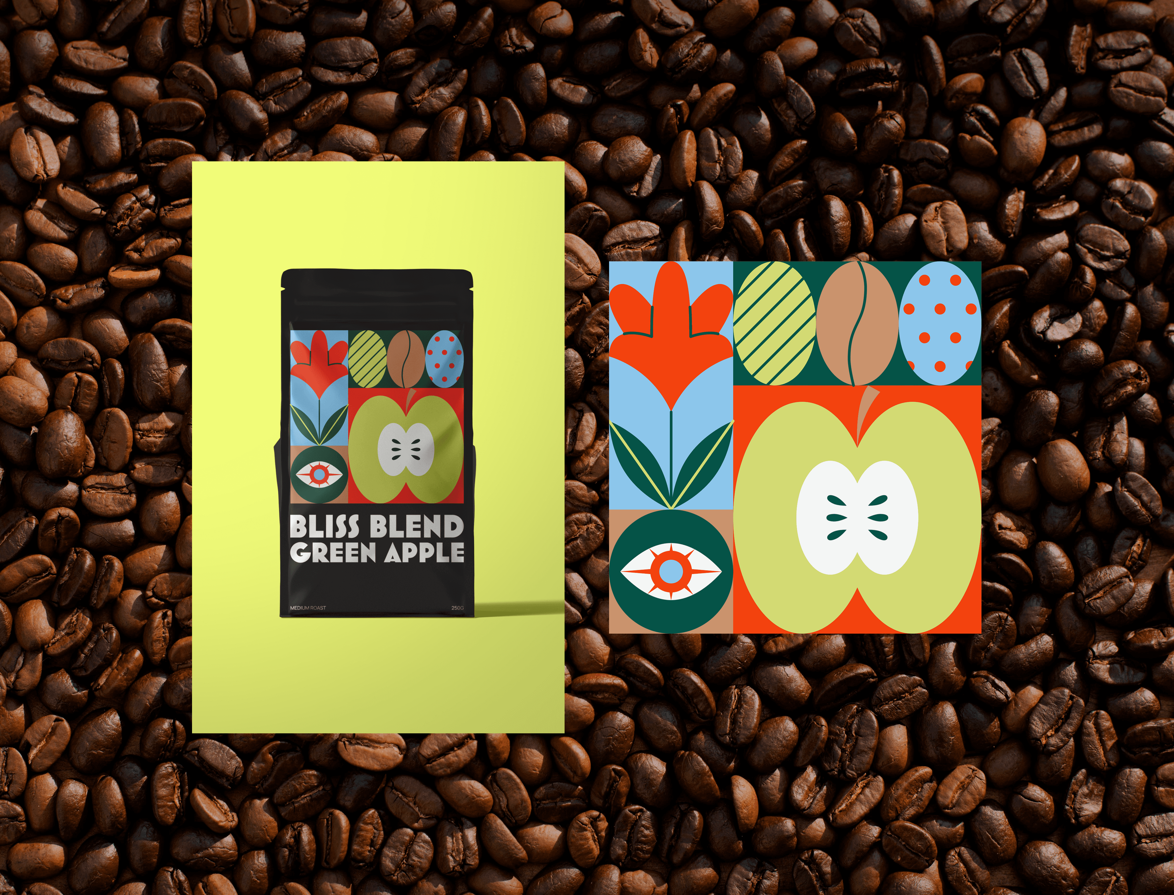
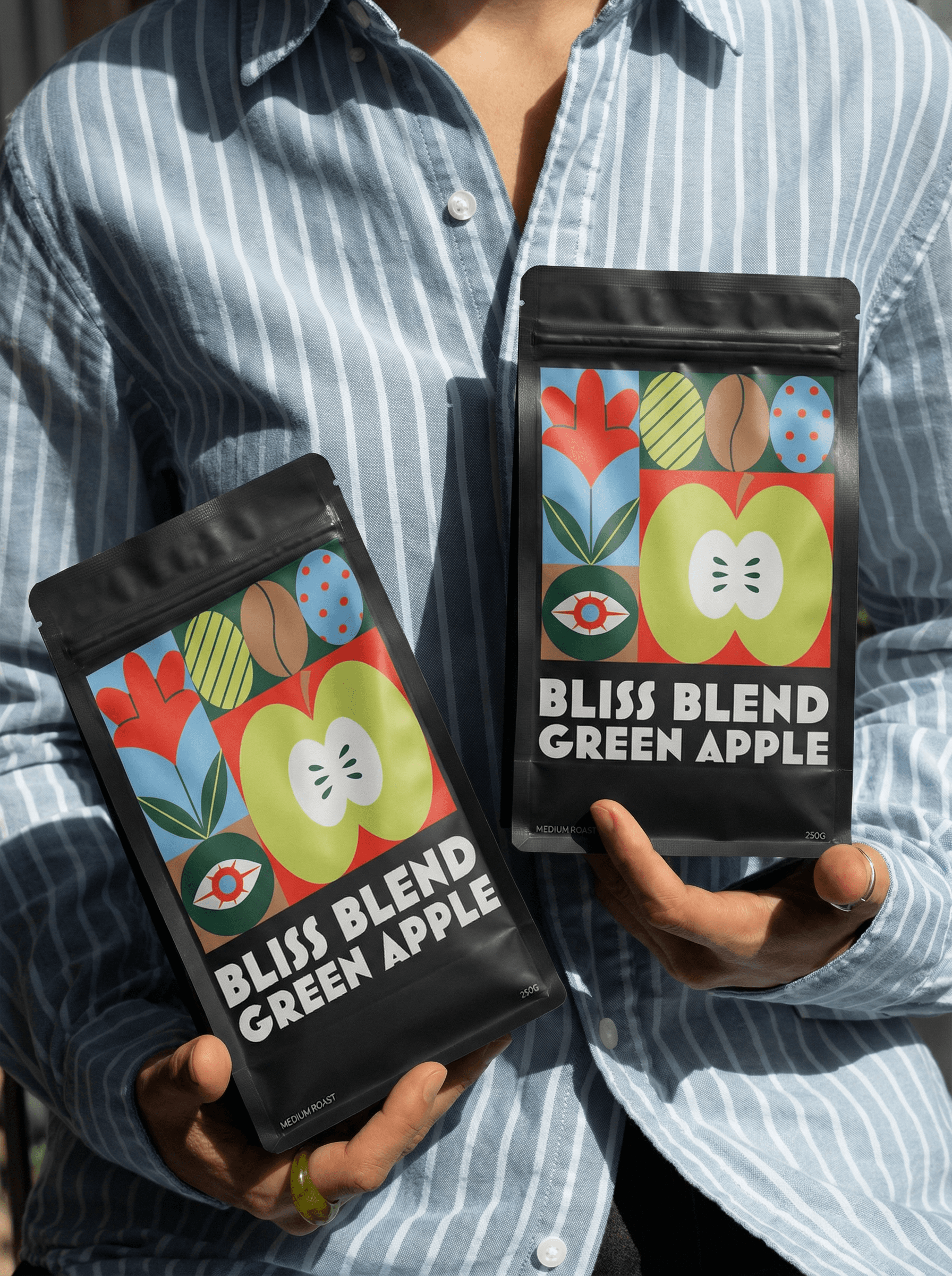
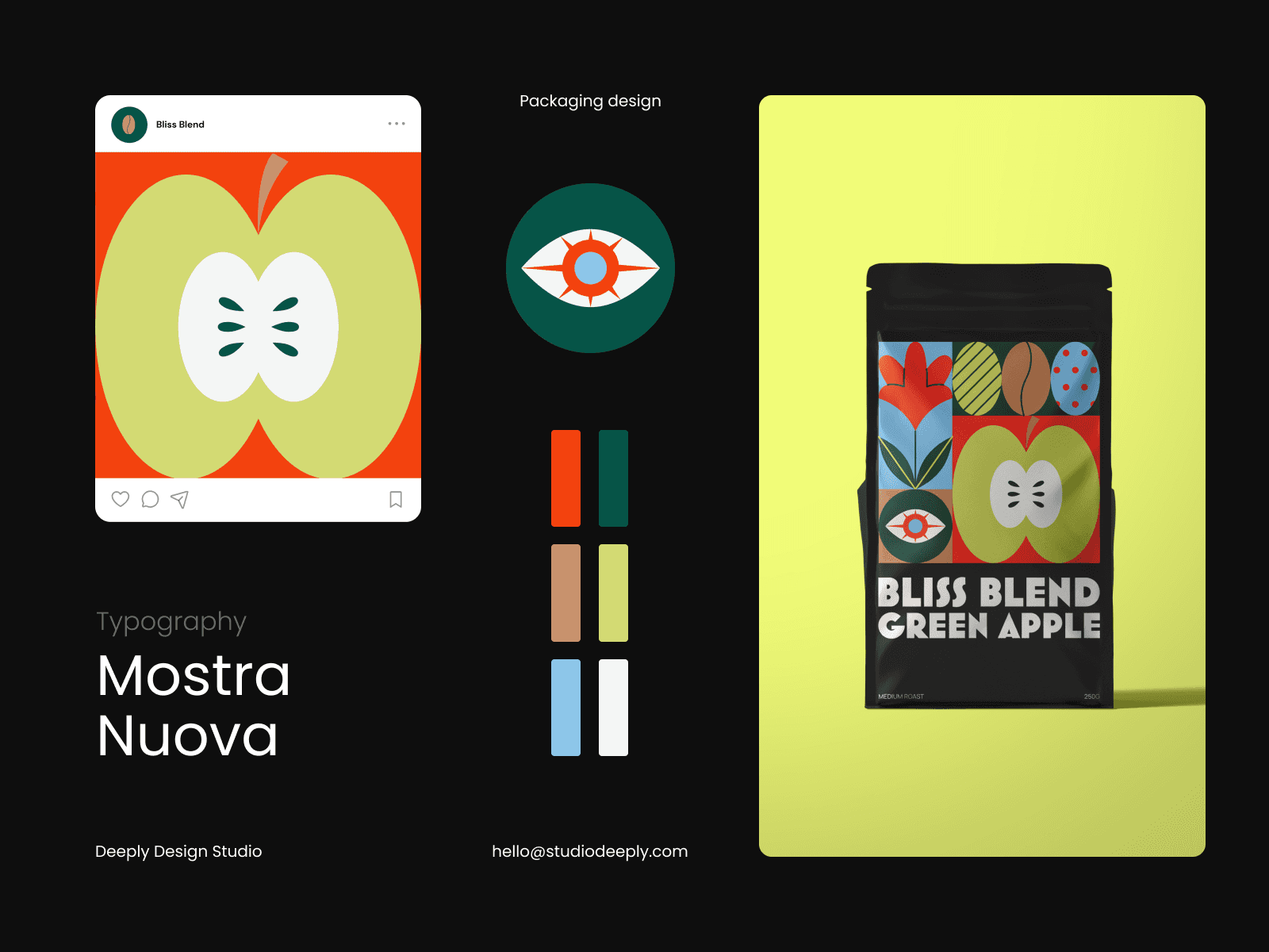
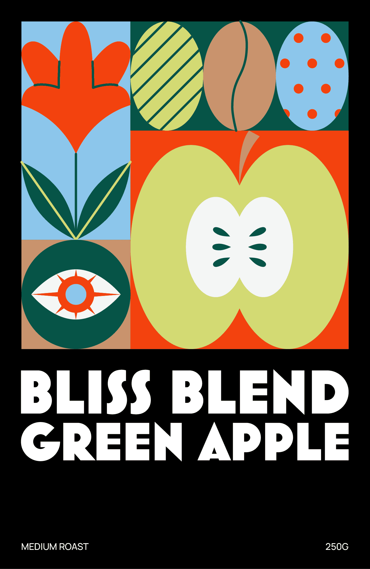
A full packaging concept — illustration and label design — that positions Bliss Blend as a specialty product with a strong visual identity. Bold enough to stand out on a shelf, considered enough to hold up close.